My original thought was to design something really tabloid-ey and/or pulpy. I was thinking National Enquirer or the Weekly World News. I had been thinking about L.A. Confidential, the Curtis Hanson movie from 1997. In the movie, Danny Devito plays the editor of a tabloid called 'Hush Hush'. Sid's line was always "Off the record, on the QT, and very hush-hush." From there, I started to think about the new design in very film noir terms. Something similar to, maybe, the Singing Detective poster...

Anyway, that was a year ago. Things change, I forget what I was even thinking about at the time (truth be told, that happens for me within about five minutes of any one original thought). Today, when I started, I headed over to Google Images and searched for Tabloid. There were some thoughts that seemed interesting, but nothing that really wowed me. I played around with the Weekly World News logo a little bit but I really wasn't feeling it. Then, I started to think about pudgy superheroes, put on Michael Giachinno's score to The Incredibles and started to think about pulp again.
One of the first images I saw was this

I knew this wasn't the right image, but I really felt like it was starting to head towards the vibe I was feeling. I dug through some more images and came upon this

I felt like the "All Night Stand" could be a logo so I grabbed a chunk of the lettering, went to What The Font (I love What The Font. I can't imagine living without having it as a resource. Maybe someday I'll have a mind for fonts, being able to pick out a font by just glancing at it, but for now I just have to settle on a piece of software that can do a pretty good job of guessing for me)
I'd post the results of the first round but I think I sabotaged myself. I really meant to save the logo and, for whatever reason, didn't. I did get two things out of the first design though, the colors and the idea to put some weathered texture on top of my logo text.
Not feeling the design, I went back to google and wandered to another pulp covers site.
There, still thinking about the red and yellow colors, I stumbled on this..

I really liked the lightning bolt headline. I wasn't as excited about the fonts, but that wasn't as much of an issue. I wandered over to my favorite comic book fonts site, and came across a couple fonts I really dug; Detectives Inc. and Feast of Flesh!
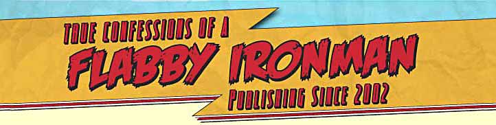
I pulled the image into Illustrator and started to sketch out the lightning bolt header.
Now, when you're sketching something in Illustrator (or any other design program), break down what you need to do into simpler items. I could use the pen tool to trace along the edges of the lightning bolt, but it's much easier to rotate the image and draw primitives. By straightening the lightning bolt I can draw a rectangle and then select just one of the points of the rectangle to create my angle. Then, I copied the first rectangle and used the reflect tool to create an object that matched up with right part of the lightning bolt. I copied the second triangle and pasted it again. I matched up the bottom part of that object to the bottom of the first rectangle and then adjusted the third object to make the middle part that connects the two objects. Then, to combine everything you just use the Merge tool inside the Pathfinder palette. The other reason for designing the object straight is so that you can lay out your text straight. Then when you rotate it, the text is all rotated to the same angle as your lightning bolt. Are there other ways to do it? Sure there are and, in some cases, I imagine they might work even better, but this is the way I work.
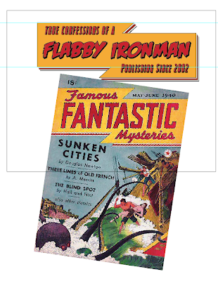
Here's version one of the logo layed into the background I had grabbed for the original logo I mentioned above.

Now, when you're sketching something in Illustrator (or any other design program), break down what you need to do into simpler items. I could use the pen tool to trace along the edges of the lightning bolt, but it's much easier to rotate the image and draw primitives. By straightening the lightning bolt I can draw a rectangle and then select just one of the points of the rectangle to create my angle. Then, I copied the first rectangle and used the reflect tool to create an object that matched up with right part of the lightning bolt. I copied the second triangle and pasted it again. I matched up the bottom part of that object to the bottom of the first rectangle and then adjusted the third object to make the middle part that connects the two objects. Then, to combine everything you just use the Merge tool inside the Pathfinder palette. The other reason for designing the object straight is so that you can lay out your text straight. Then when you rotate it, the text is all rotated to the same angle as your lightning bolt. Are there other ways to do it? Sure there are and, in some cases, I imagine they might work even better, but this is the way I work.
Here's version one of the logo layed into the background I had grabbed for the original logo I mentioned above.

I like it, but I really felt that the header was way too big. I went back to the drawing board and elongated the header and set it up so that it didn't need to be rotated as much.

After slimming down the header I added a little bit of texture and added the blue (I thought it kind of reminded me of the original cover)
I felt the black wasn't working and I thought about what might more appropriately replace it. There was a tutorial over at psdtuts a couple of weeks ago all about creating a 'desktop' from scratch in Photoshop. That article made me think that maybe the warmth of the header would go with the warmth of a desktop. I tried searching shutterstock for 'desktopy' wood and ended up going back to the photoshop tutorial and grabbing the wood texture they linked to there. The image they linked to was much too big to integrate into a weblog background so I chopped a chunk of it off and massaged it into a repeatable background.
I have a quick and dirty trick for creating repeatable background patterns: mirroring. Grab a piece from the top of the design you want to repeat and paste it into a new layer. Flip it vertically so that the top is now the bottom and bring it down to the bottom of your new repeating texture. Create a new mask for that layer and draw out a gradient. With some massaging you should have a texture that's fairly seamless. You might need to massage it some more to make it look less repetitive. To make the left and right side repeat, use the same steps but in the other dimensions.
Here's where we were with the new backdrop

It felt really good, but it also felt like it needed something to anchor the design... enter, the footer

you can also see my first attempt at sidebar headers. I decided that the text needed to be straight to look normal with what would be straight links. I went into Illustrator, copied the text I had created for the header and proceeded to use the find and replace command to change the text on each of the three instances that combine each of the phrases. "Flabby Ironman" had three layers to it. The first layer consisted of the red. A second layer behind it added the stroke. I could have added a stroke to the red but (and this may have changed) in previous versions, when you add a stroke it starts to constrict the inner fill color. By putting the stroke on another layer that's behind the red, the red can stay the same as the stroke grows from behind it. A third copy of the text goes behind that layer of black and down and over a few pixels, creating the pseudo 3d look. By using find and replace I could change all three layers of text in one shot. Pretty slick.
Here's what my sidebar headers looked like when I was done.

bringing that text into photoshop I chopped each of the lines of text up into transparent gifs. A bunch of time later after dealing with messy code, I ended up with all of the elements positioned. I was surprised that it was easy as it was to get everything into place. Things didn't work QUITE like I thought they would, but, aside from the border around everything it looks pretty much like I thought it would.
Off to bed. Tomorrow's another 'fake Monday' morning.
More tomorrow.
No comments:
Post a Comment